Blast from the past

What I have for you this week are just a few websites that give us access to the past, an historical artifact that uncovers a mystery, and some new ways to do timelines.

World Digital Library

A great resource, hopefully, for scholars. From their website….

“The World Digital Library (WDL) makes available on the Internet, free of charge and in multilingual format, significant primary materials from countries and cultures around the world.

The principal objectives of the WDL are to:

  • Promote international and intercultural understanding;
  • Expand the volume and variety of cultural content on the Internet;
  • Provide resources for educators, scholars, and general audiences;
  • Build capacity in partner institutions to narrow the digital divide within and between countries.”
cuneform digital library initiative

Related to the WDL, is the CDLI. From their website….

“The Cuneiform Digital Library Initiative (CDLI) represents the efforts of an international group of Assyriologists, museum curators and historians of science to make available through the internet the form and content of cuneiform tablets dating from the beginning of writing, ca. 3350 BC, until the end of the pre-Christian era. We estimate the number of these documents currently kept in public and private collections to exceed 500,000 exemplars, of which now nearly 225,000 have been catalogued in electronic form by the CDLI.”

John Harrison sea clock

And here’s a short read on an interesting historical topic. It seems the history of the longitude will need a small rewrite. What’s most amazing, though, is the skill and craftsmanship of the compass at the heart of this historical debate.  Created over 270 years ago, the original parts show no sign of wear and tear, while replacement parts broke down after 80 years. A remarkable piece of history.

The controversy surrounding this clock comes from recent work to replace broken parts from the initial attempt at restoration. It was originally believed that John Harrison created this clock all by himself. He being originally a carpenter, some scholars are a bit skeptic that he could create the intricate brass work needed to create the piece.  The most recent repairs have lead people to believe Harrison had help, and probably commissioned out certain pieces. Comprising over 2000 pieces, this sea clock is a marvel of itself, regardless of who made it.

Now it’s time for some timelines!

It was a shameless publicity post to slashdot, but the timelines got me thinking of other timelines, especially as I’m creating one of my own using MIT’s Exhibit builder, and have created one for a course. So, here are a few timeline tools mentioned in the article.

simile-timeline SIMILE’s Timeline: easy to use, just point it to a data file (which is the most dificult part)
timeglider TimeGlider: Looks like a flashed based version of SIMILE’s product. A few different features. Here’s one in action, Rosenberg Cold War trials.
googlenews Google’s News timeline: you can do searches on other things as well. Kind of like a modern timeline.
timerimeTimeRime: They’re in this for the money, and it doesn’t look all that great, but I didn’t spend but more than a couple seconds looking around.

The history of abandoned things

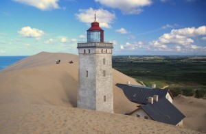
Buried in sand: The abandoned Rubjerg Knude Lighthouse

I came across the site Artificial Owl this week. Artificial Owl finds images of long forgotten, man-made objects, locates them on a map and tells a bit of the story behind the object if possible. I was initially struck by the beautiful images of buildings, ships, airplanes, and automobiles left to deteriorate and crumble back to nature. I love the imagery of nature reclaiming her elements. It’s a definite reminder that man and his creations will not last longer than mother earth.

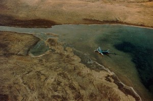
There were a number of images of airplanes, which I was glad to see, since I like them most. One of them was particularly interesting for a couple of reasons. First of all, it’s a picture of a B-29. I love B-29s and B-17s from World War II. The reason, besides them being beautiful airplanes, is because my grandfather was a belly gunner in a B-17 during WWII. He, and an uncle, had numerous models and paintings of B-17s and other WWII fighter planes in my grandpa’s basement. I even put together a model of a B-17 myself as a kid. So, naturally, my interest was peaked. Another reason I was interested in this picture is because I remember hearing about it. The very brief history of this airplane goes like this.

B29 Kee Bird, on frozen lake near Thule, Greenland

In 1947 the Kee Bird (as it was called), was on a top secret spy mission. It made an emergency landing on a frozen lake near Thule, Greenland. The crew were all fine and rescued, but the airplane was left. In the 1990s, a few older gentlemen decided they would rescue the airplane. After lots of money and time (nearly a year), they repaired the engines and minor damage to the plane, and prepared to take off. As they taxied around the bumpy frozen lake, one of the generators used for power broke loose and started a fire in the airplane. All of the crew escaped, but the airplane was destroyed by fire. When the lake melted in the summer, the plane sank to the bottom, never to be seen again.

All of this got me thinking that this would be an awesome way to do history. There is so much information connected to this one airplane, that it could easily fill a book or documentary. I haven’t read either of them, but either would definitely be an interesting read. It would be fun to research the history of the plane, the details and reasoning behind the flight, the biographies of the crew, and all that jazz. There is so much history that can be incorporated into the story of this airplane.

This could be done for all of the images on Artificial Owl, in fact for any abandoned man-made object. As I reflect on that, this is precisely what I want to do with my dissertation. I want to focus on one abandoned tunnel in Halberstadt, Germany. It was used by the Germans before, during and after WWII. It think telling the story of this tunnel can incorporate many aspects of German history around it. Time will tell on how that works out.

Well, I’ll leave you with a few more pics of possible historical tales…

B29 Kee Bird, abandoned plane, near Thule, Greenland
Abandoned old planes at La Paz - Jfk International (El Alto) Airport - Bolivia
Shipwreck of the Galant Lady on Bimini island, Bahamas
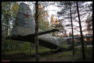
Antonov An-8 at rest in Russian woods.
 

(All images courtesy Artificial Owl, used without permission – thanks!)

Finished 1989 Flash Map

I had to dig this out of the depths of my computer today, and a quick search showed that I never posted the final version. So here it is in all it’s glory. 1989 Events

[kml_flashembed fversion=”8.0.0″ movie=”http://chnm.gmu.edu/staff/ammon/1989/1989events.swf” targetclass=”flashmovie” publishmethod=”static” width=”540″ height=”360″]Get Adobe Flash player

[/kml_flashembed]

History of Software Applications

There’s a really cool new way to visualize the creation of software. It’s called code_swarm. Developed by Michael Ogawa as a way to do just that, visualize the creation of software. He’s a sort of software anthropologist. Not so much interested in the software, but how people interact to create it.

Here’s an example using the programming language Python (something I want to learn one of these days).

I think this is a great way to visualize history as well. I can imagine this being used with another idea I had a while back. Instead of tracking files and creators, track people and their movements. This would be great for looking at a family history. It would be cool to have a GEDCOM file of thousands of ancestors, plug it into this application, then watch as your family members come alive on a map, move around, and fade into history. I have ancestors from Sweden, Germany, England, and many places in the United States. It would be awesome to see their history plotted out this way.

It could even work on a smaller scale. How bout your own life’s travels plotted out.

Keeping on track with my readings course with Dan Cohen about history and new media (which I need to post about), how does this type of new media affect the study of history? If we plug in the details about an ancestors decision to move from, say, Sweden to Utah, can we better understand how individuals affect many generations afterwards? Will seeing the large number of ancestors in one place affect how we view ourselves in life? My thinking here is that we’ll see on one screen a large number of people living and moving, and eventually making you. If there were other important events plotted during the same timeline (perhaps a better term is a moveline), would that help us better understand the context of our ancestors history?

Lots of stuff to think about. And a large project to implement. Fortunately the source code for code_swarm is open source and freely available.

Lego History and the Rosetta Stone of the future?

LEGOS

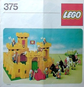
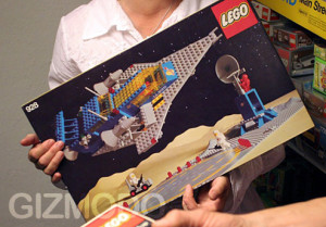
The lego minifig (the little human figure) is celebrating its 30 year birthday today. Yeah Lego! Gizmodo is running a contest for best picture or short film using the minifig. The first and second prizes are the best Lego sets of all time! My brothers and I got these sets as kids. So many memories

Yellow Castle Set
Galaxy Explorer Set

So many, many meomories come flooding back when I see these pictures. Most of the pieces of these sets are still at my parents’ house.  Check out the videos on Gizmodo for a quick history of the world, told by Legos.

ROSETTA STONE

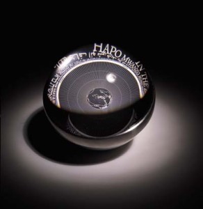
I heard through Slashdot about a project to create the ultimate Rosetta Stone of the future.

Rosetta Front

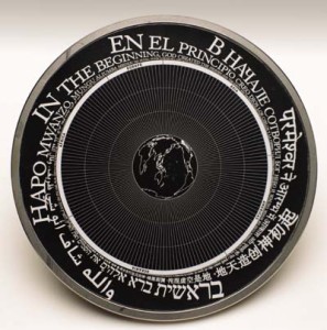
The disk will contain text inscribed in nickel, making it impervious to water and all but physical destruction. Written in eight languages, the disk contains over 15,000 documents. The only technology needed to view and decode this disk is a magnifying glass… with a magnification of at least 1000x. From the website…

The Disk surface shown here, meant to be a guide to the contents, is etched with a central image of the earth and a message written in eight major world languages: “Languages of the World: This is an archive of over 1,000 human languages assembled in the year 02002 C.E. Magnify 1,000 times to find over 15,000 pages of language documentation.” The text begins at eye-readable scale and spirals down to nano-scale. This tapered ring of languages is intended to maximize the number of people that will be able to read something immediately upon picking up the Disk, as well as implying the directions for using it—‘get a magnifier and there is more.’

Rosetta Top
Rosetta Top

On the reverse side of the disk from the globe graphic are 15,000 microetched pages of language documentation. Since each page is a physical rather than digital image, there is no platform or format dependency. Reading the Disk requires only optical magnification. Each page is .019 inches, or half a millimeter, across. This is about equal in width to 5 human hairs, and can be read with a 500X microscope (individual pages are clearly visible with 100X magnification).

The idea is to replicate this disk as many times as possible and distribute it to as many places as possible to ensure survival of knowledge if modern civilization were to be destroyed. You can put yourself on the waiting list to own one of these disks, for the relatively low price of $25,000.

I like to imagine if the civilization of today were to disapear and the people of the future were to grab hold of this disk, they would be able to learn how the world was at this time. I wonder, though, if the prevalence of information makes such a disk necessary. It’s hard for me to imagine that all of the data in the plethora of different formats (print, digital, textile, etc) will be destroyed. I do, however, wonder how digital media (text, image, video, etc) will be available in the future. We can already see the trouble of getting data from older media formats like laser disk and 5-inch floppy disks. If the data is properly brought forward with technology (ie. nowadays the best storage media is hard drives, particularly external drives attachable via USB or FireWire) it should always be accessible.

Graphical representations of genealogy

I have this thought, and it was brought to mind again by an article on Wired which linked to this artists (Jason Salavon) work with the US census data. Basically, he took the US census data over 200 years and created an image with a ribbon of color representing each county.

My idea is similar, kind of. While thinking about projects to do for my history and maps class this semester, and while talking with a colleague, I wondered how one could graphically represent ones genealogy. Most of us in the United States have ancestors that came from somewhere else. Many of us have ancestors that came from multiple somewhere elses. Looking at my ancestry alone I claim Arizona, Colorado, Utah, England, Sweeden, Germany and I’m sure several other places I don’t yet know of. One thought as to how to do this would be with a world map and lines and dots representing locations and familial connections. The lines and dots would be in gradients of color, each color representing a date. I tried doing a mock up in Photoshop quickly, but it wasn’t working right. I’ll have to do it in Flash, since that behaves like I expect. Flash might be a better platform anyways, because the map is then dynamic and can be dragged, zoomed, and dots and lines can be given data associated with them.

Omeka goes live

Omeka, another fine product produced by CHNM, has released the public beta. This is a great tool for museums and other places (or individuals) who want to create online exhibits.

In other news, there is now a growing movement to archive old skills that are no longer used. Mr. Scoble started a list of obsolete skills on his blog and later made a wiki about it. Now everybody can contribute their obsolete skills. Not only is this a humorous way to look at the evolving world of technology, but it provides a useful archive for anyone who might run across the need to use one of these obsolete skills.

History of Google's logo and goodbye to Polaroid

Wired has a neat little article/slideshow depicting the process of designing the Google logo. It’s interesting to see the first design compared to the last (current) design, and how similar they are.

Along with this article, take a look at Google’s archive of past logos for holidays and other events. It might be worth a look into the different holidays and events that are portrayed by Google’s logo.

Also, on a sad note, a bit of technology fades into history. The Polaroid instant photos have been discontinued (over the course of the past two years). The thrill of an instant photo was one of my child hood memories. Something my children won’t have. Now we we’d have to truck along a printer to get the same instantaneousness.